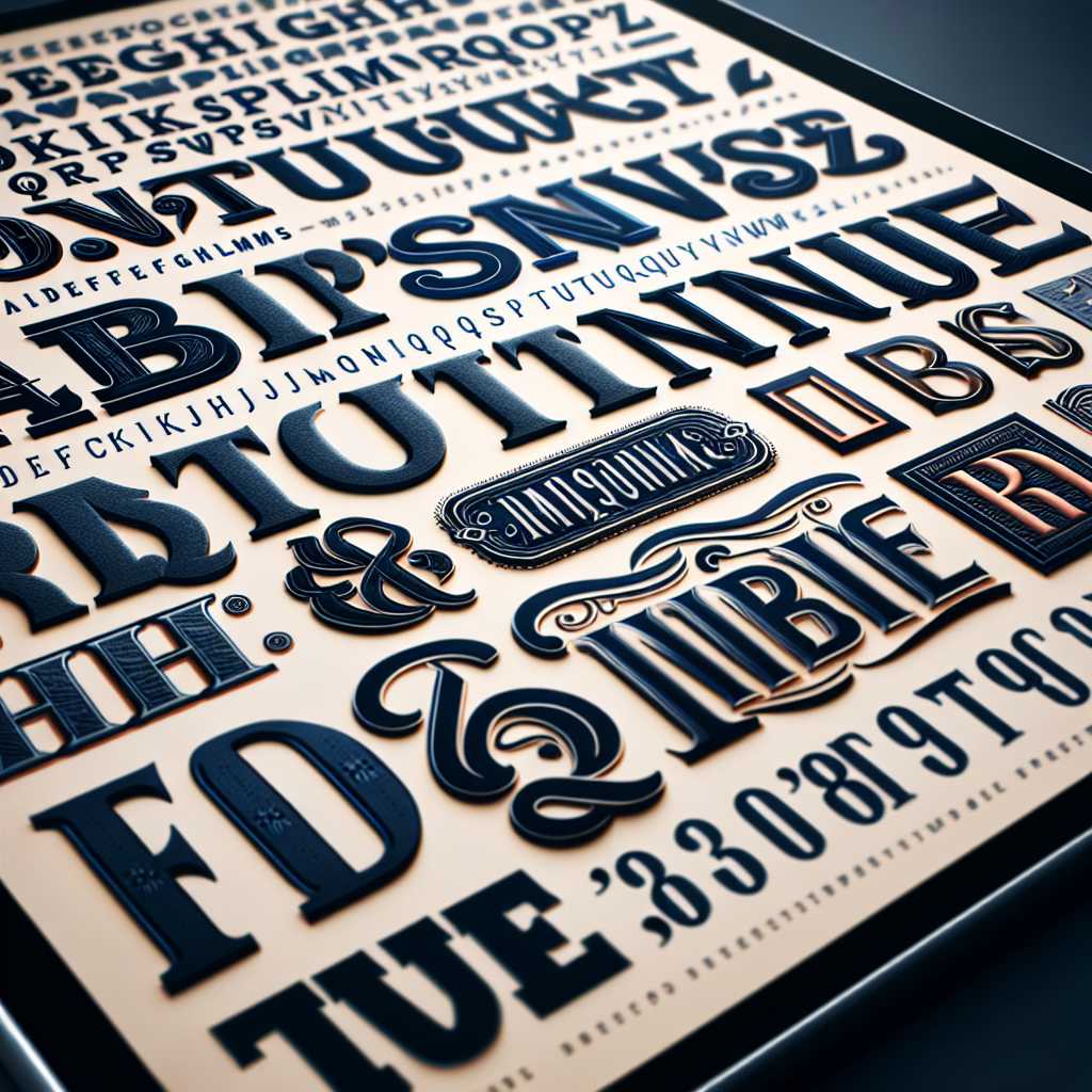
The Comprehensive Guide to Understanding Fonts in Typography
Understanding fonts and their impact on communication is an integral part of designing and representing text, whether in print or digital media. This article delves into the history, categorization, and current trends of fonts to help readers grasp the complex, yet fascinating world of typography.
A Brief History of Fonts in Typography
The evolution of fonts can be traced back to the days of movable type and printing presses. With the invention of the Gutenberg press in the 15th century, the first typeface — Blackletter — was widely used across Europe for printed works. Since then, these early typefaces have undergone countless transformations, paving the way for the elaborate system of font classification we know today.
Through centuries of artistic, cultural, and technological developments, distinct typefaces such as Roman, Italic, and Gothic emerged. With the industrial revolution came advances in printing technology, and font design became an important commercial enterprise. The development of computer technology and digital typography led to rapid expansion and easier access to a wide range of typefaces for both professional designers and casual users.
Differentiating Typefaces and Fonts
Often used interchangeably, ‘typeface’ and ‘font’ are two distinct terms. A ‘typeface’ refers to a set of characters that share common design features, while a ‘font’ is a specific variant of a typeface that includes a complete set of letters, numbers, and symbols of a particular size and style. Understanding this difference is critical when discussing fonts within the realm of typography.
Deciphering Font Classification Systems
Fonts can be classified by various characteristics such as their lineage, form, or function. Broadly speaking, fonts fall into several major categories:
– Serif Fonts: Recognizable by the small lines attached to the ends of letters (serifs), these fonts are traditional and often used for lengthy texts due to their legibility. Popular examples include Times New Roman and Garamond.
– Sans Serif Fonts: Sans serif typefaces lack these finishing strokes and offer cleaner lines which make them appear more modern. Helvetica and Arial are notable sans serif fonts.
– Display or Decorative Fonts: Created for attracting attention rather than prolonged reading, these fonts come in numerous styles and are often more expressive.
– Script Fonts: This category encompasses typefaces with fluid stokes that mimic handwriting or calligraphy, such as Brush Script or Edwardian Script.
– Monospaced Fonts: In this fixed-width font family every letter occupies the same horizontal space. Courier is one classic example.
Developments in font technology, such as OpenType fonts now allow designers greater flexibility with alternatively styled letter forms called glyphs, that can adapt to varying contexts.
The Role and Impact of Fonts on Communication and Design
Fonts play an immensely crucial part in communication — they affect readability and can influence perceptions sublimaneously by reinforcing the mood or character of a text. Companies invest significantly in custom fonts to establish brand identity. Moreover, web designers carefully select web fonts that ensure cross-compatibility and optimal online reading experiences.
Typography Trends in Technology and Digital Media Engagement
Technological advancements such as high-resolution screens and versatile web design tools have greatly influenced font trends. There has been a noticeable surge in the creation of adaptable fonts designed to deliver consistency across devices with different display qualities. Variable fonts, with an ability to transform their weight, width, or style dynamically are gaining popularity amongst digital UI/UX designers for their efficiency.
Accessibility Considerations in Font Selection
Choosing an appropriate font involves more than aesthetics; accessibility demands that text remains functional for all audience demographics, including individuals with disabilities. For example, certain sans serif fonts are commonly recommended for dyslexic readers because they reduce confusion between similarly shaped letters.
